Prezi Viewer - Slideshows on-the-go
Transform presentations into engaging visual stories with Prezi Viewer.

- 2.29.0-13775 Version
- 2.3 Score
- 4M+ Downloads
- Free License
- 3+ Content Rating
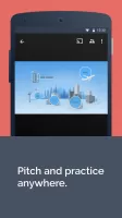
Are you preparing for a presentation but running out of time to practice? The Prezi Viewer app, available on Android devices, offers a convenient solution. It allows you to view, practice, and deliver presentations while on the move.
Imagine traveling to an important business pitch or meeting; you can utilize your transit time to run through your presentation on your mobile device. Once you reach your destination, simply connect via Bluetooth to your PC or Mac to present on a larger screen.
Picture this scenario – you find yourself seated beside a potential client during your flight home. With Prezi Viewer, you can access your saved presentations offline, ensuring you're always prepared to showcase your work.
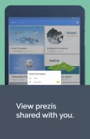
Whether you need to view, practice, or present, Prezi Viewer accompanies you wherever you go:
* Access and view all your presentations online or offline
* Experience seamless rendering similar to that on a computer
* Share your presentations by sending a link via email, messaging apps, or social media
* Collaborate on presentations by providing feedback and comments
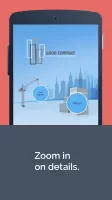
* Utilize touch gestures such as pinch-to-zoom and drag to navigate your canvas
* Connect your Android device to showcase your presentation on a large display
Five ways to make images stand out in a presentation
1. Find the most fitting visuals
A well-chosen background image can give a whole new meaning to your presentation and it should be a visual metaphor complementing your message. Additional images you use can have an equally great impact so make sure to choose visuals that match your topic and help your audience focus and understand what you’re talking about.
2. Crop it and drop it
Found a great visual but its dimensions are off? No problem, you can crop your image so it really fits into the frame.
3. Make your image pop
Choose an image that fits into the color scheme and general mood of your presentation. You can also cheat if necessary: with the help of the image editor, you can easily adjust the image or use a filter to make it even more appealing.
4. Put it where it really belongs
Resize your image in a way that it is not too distracting but still meaningful and gets the attention it deserves. Think outside the box (literally) and experiment with unconventional image placement: your visual can still be in focus even if it isn’t in the middle of the screen!
5. Use animations to bring your image to life
You have the right place, all you need now is the right time: use animations to make your image seamlessly blend into the story and to keep it moving!
5 simple steps to create great Prezi presentations
1. Give the story some background
Jimmy wants to make a spectacular first impression on his potential investors. Thus, he needs to make sure the overview of his presentation is clear, crisp, and conveys his message.
The first step to doing this is to choose a background image that is visually meaningful and easy on the eyes. This requires some careful consideration, but here are some general tips to point Jimmy in the right direction.
Do:
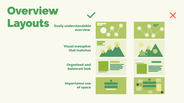
Choose a meaningful background image that brings out the message and theme of the presentation. This can be done through metaphor by using a relevant visual in the image, customizing the color scheme, and utilizing negative space*.
Consider how many topics will be on the overview and plan their placement. Use lines, curves, and negative space to align topics and show the direction the presentation will follow.
Don’t:
Use an image that is crowded, busy, or has too many colors. This might confuse and distract the audience.
Put too much text and information on the overview. Instead, use topics to cover the main ideas, then organize related content within them into subtopics (see “structure” below).
*Negative space is an area without text or graphics.
2. Structure to success
Now that Jimmy has the perfect background image and topic layout, he needs to build out the structure of his presentation. To do so, he should organize his ideas and content into topics and subtopics. By grouping similar information together, Jimmy’s presentation will be understandable and follow a clear flow.
Drawing a mind map of a presentation before starting is an easy and effective method for planning the structure. Sketch out ideas and draw lines between them to see how they connect. Then, use the mind map to build layers of planet and stack topic structures to hold the content and information.
3. Hit the mark with text and visuals
We all know a picture says a thousand words, and we think Jimmy should use this to his advantage in his big presentation. The key to making a powerful impact with an audience is to connect with them visually. Getting this right is all about creating balanced design of text and images.
Tips to get it right:
Group content into easily digestible segments. Don’t give too much information to an audience in one frame of view.
Make sure the layout of each view in the presentation is visually balanced. Move and place objects throughout the entire view to create harmony and symmetry.
To avoid large blocks of text, compliment small text snippets of the main idea with a relevant image. It should be visually clear what the message is by first glance.
Use easily readable fonts and text colors. As a general rule, mixing multiple fonts or colors together in the same box of text is a recipe for confusion.
4. Animate and inspire
With the fundamentals of Jimmy’s presentation looking good, it’s time to add some pizzazz. The next way Jimmy can spiff up his presentation is to add some animations and zoom. This will create smooth transitions between ideas and bring life to his content.
The ability to zoom in and out of the presentation canvas to create impactful visual transitions is what makes Prezi Present presentations unique. With zoom and animation effects, the creative possibilities are endless.
5. Timing is everything
There’s nothing like a little suspense, and a bit of surprise, to make a story more interesting. To make sure that Jimmy’s potential investors don’t lose interest along the way, it’s best to keep some content hidden until just the right moment.
Jimmy, and you, have the tools to do this by using:
- Fade-in, and fade-out, animation to show and hide content when presenting.
- Zoom areas to dive and pan throughout key spots on the canvas.
- Topic cover visuals to reveal content within your topics and subtopics.
- A little creativity to make your entire story come together.
Just like the secret ingredient in the lemonade recipe, Jimmy has another ace up his sleeve. He already has a “secret investor” for his project, and it’s someone his dad knows well. All he has to do is hide that compelling piece of information until the time is right. Then, he can be sure his lemonade stand will get the funding it deserves.
Explore how Prezi enhances your presentation skills:
* Enhance engagement and persuasion by integrating visual storytelling into your message
* Modify your presentation in real-time based on the flow of conversation
* Zoom in to highlight specifics and pan out to show the broader context
* Feel confident knowing audiences prefer Prezi over traditional slides
Language support: English, Spanish, French, German, Portuguese, Italian, Korean, Japanese, Hungarian
- Version2.29.0-13775
- UpdateAug 30, 2024
- DeveloperPrezi
- CategoryProductivity
- Requires AndroidAndroid 5.0+
- Downloads4M+
- Package Namecom.prezi.android
- Signature7acc2f6423f82d68f60cef623098608d
- Available on
- ReportFlag as inappropriate
-
NameSizeDownload
-
28.46 MB
-
28.45 MB
-
28.56 MB







Supports Prezi's dynamic and non-linear presentation methods
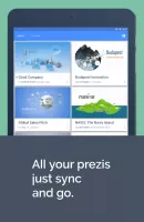
Can be synchronized with Prezi online accounts
Supports offline viewing
Does not support editing or creating new content for Prezi presentations
Does not support other types of file formats, only Prezi format documents can be viewed