Total Launcher - Customize & personalize homescreen
Customize your Android homescreen to perfection with Total Launcher's endless possibilities.

- 3.0.9 Version
- 4.7 Score
- 1M+ Downloads
- In-app purchases License
- 3+ Content Rating
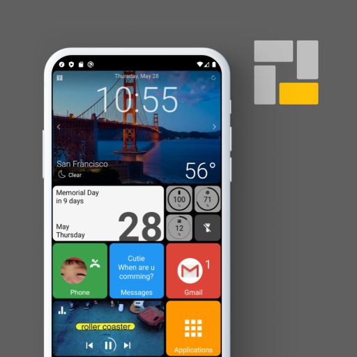
Total Launcher is the finest customizable launcher available for Android. It remains fast, light, and user-friendly.
Prefer a simple home? Utilize this launcher.
Enthusiastic about a beautiful home? Opt for this.
Seeking a smart home setup? This is the one for you.
If there's no existing launcher to your liking, create your own using Total Launcher.
This launcher caters to all your home screen desires.
How can I access the menu?
There are 3 ways to open the menu screen:
- pinch-in gesture on any page.
- long-press the empty area of a page.
- press menu button if your device has it.
Use Guide
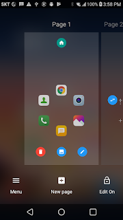
Managing Pages
Pages are arranged horizontally and you can turn over page by page by swiping to the left or right. You can add, remove or arrange the pages in the menu screen and each pages can be made vertically scrollable in the individual options.
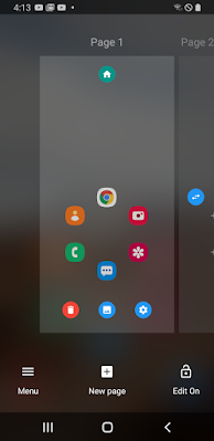
Menu Screen
To know how to access the menu screen, please read the item 3 in FAQ.
1. Adding a new page
Basically, you must turn on the edit mode first to edit something in Total launcher. Just toggle on/off the locker button on the bottom of the menu screen to turn on/off the edit mode. While the edit mode is on, the "New page" button is activated on the bottom.
2. Sorting the page order
There is the swap button between pages and press it to exchange the positions.
3. Changing "home page"
One of the pages can be set as a "home page", which gets shown first when the launcher is started newly or you press the home key on another page. The first page is home in the default settings and you can see the "green" home icon on it in the menu screen. You can change another page to the home page by toggling the home button on the page. The button color is green for the current home page and yellow for the others.
4. Removing a page
Press the remove button on the page that you want to remove.
5. Page background (wallpaper)
Total launcher supports different backgrounds (wallpaper) for each page and each screen orientation. This can be set independently of the "system wallpaper", which is shared for all launchers. Press the the image button to set backgrounds of the page.
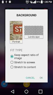
Page background options
Tap one of the previews in the dialog to change the background for the portrait or landscape orientation. (You know, TL supports different designs for each screen orientation).
"Fit type" is the option for how to show the background image on the page.
- Keep aspect ratio of image: The image will be cut (not stretched) to fit to the full screen.
- Stretch to screen: The image will be stretched to fit to the full screen.
- Stretch to content: The image will be stretched to fit to the content when the page can be scrolled vertically. When the content height would be larger than the screen height, the image gets stretched to the content height and is scrolling vertically.
6. Page options
When you press the option button , more options for the page are available.
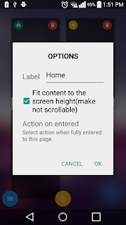
Page options
- Label: Edit the label of the page.
- Fit content to the screen height (make vertically unscrollable): When this option is off, objects can be positioned out of the bottom of the screen and the page gets to be vertically scrollable. (Read the item 11 in Handling objects).
- Action on entered: Select an action (open an app or a shortcut) when fully entered to the page. (Watch this video to know how the option works.)
Handling Objects
1. Selecting an object to edit it.
Basically, you can select an object by long-pressing on it. But for some of built-in widgets like App group, App drawer and Contacts, you must long-press on the edge of it. Another way to select an object is "area selection" by pressing the grab button on the top of the screen. Press the button and draw a rectangle area containing the objects to select. All objects fully contained in the area get selected when you draw the area to the right-bottom direction. If you draw the area to the top-left direction, all objects intersected by the area get selected.
While an object is selected, you can move the selection focus to the previous or next object by pressing the "<" or ">" button on the bottom menu bar.
This video will be helpful to understand this easily.
2. Adding a new object.
Press the "add button" on the top of the screen to add an object. The new object will be added onto the currently open window or sliding drawer. If no window or sliding drawer is open, it will be added onto the current page.
The objects are categorized to the 3 types: Layout, Widget and Graphic.
- Layout: A layout is a group of items and each item consists of icon, label and badge count. When you add a new layout, it has empty rooms with the "+" sign for each items.
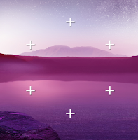
Circle layout with 6 rooms
You can set totally 5 actions for each item: tapping and 4 direction swiping. To set an action for tapping an item, just press the "+" icon. Then, you can select one of application, shortcut or many other actions. Another way is drag-and-drop of an item from another layout or widget like App drawer or App group.
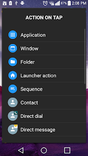
Selecting an action for tapping an item
4-direction swiping actions can be set for an item with a tap action. Just long-press the item and press the option button .
.
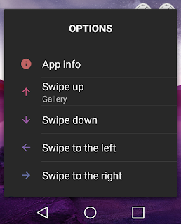
Setting 4-direction swiping actions
To customize the number of rooms or icon and label size of each item, press the option button on the top menu bar while the layout is selected. Please refer to Customizing objects for learning more about these options.
- Widget: Individual widget has independent design and features for its own purpose. Currently, 9 built-in widgets (App drawer, App group, Contacts, Media controller, Page indicator, Analog clock, Compass, Circle indicator and Drawer handle) are implemented and "Application widget" is to support 3rd party Android widgets.
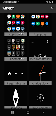
Widgets
Those have different set of options for its own purpose. Please refer to Customizing objects for more information.
- Graphic: This includes text, image and mixed. Mixed object is a combined object of text, image or other mixed graphic. To learn how to build a mixed graphic, refer to the item 9 in this page.
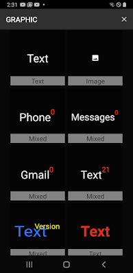
Graphic objects
Even while graphic objects are used for decorating the screen generally, you can assign totally 5 different actions for tapping or 4-directions swiping gestures on a graphic object.
3. Setting actions to a graphic object
As referred above, you can assign 5 different actions to a graphic object for tap, swipe up, swipe down, swipe to the left and swipe to the right. To set actions, press the action button on the top menu bar while the object is selected.
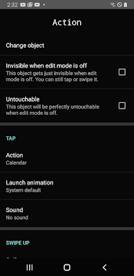
Setting actions to a graphic
For example, select "Action" under "Tap" to assign a tap action to the graphic object. You can also set the launch animation and sound effect for each action.
There are 3 useful options in this section:
- Change object: Changes the selected graphic to another.
- Invisible when edit mode is off: This graphic will get invisible when the edit mode is off. This option would be useful to make a gesture, which is invoked only from "specific location" of the screen.
Making a swipe gesture from the right edge of the screen
- Untouchable: This makes all actions disabled when edit mode is off. The graphic gets not touchable but only visible.
4. Pinning object
This concept is very simple but useful. You can pin an object onto all pages or only the pages that you want. The object will appear only on the pages and disappear on the others. Just press the pin button on the top menu bar and try to guess how it works. =) Here is another good example video for it.
How to add a dock bar
5. Copy, cut and paste of objects
Select objects and press copy or cut
 button on the top menu bar. Then, you will be able to see a small paste icon on the add button
 . Just move to a page or open a window or sliding drawer to paste them onto, press the add button
 and select "paste".
6. Reusing object
If you need to reuse repeatedly an object customized by yourself, press the save button on the top menu bar. It will registered as an user object and you can put the object anytime and any where again: Press the add button
 and swipe to the tab labeled "Mine".
To remove an user object, long-press it and press the remove button on the action bar.
7. Removing object
Select the objects to remove and press the remove button on the top menu bar.
8. Z-order of object
When you add a new object, it is put on the most front of the page. That is, the previous objects are covered by the new object. You can change this order of the object with the "to-front" and "to-back"
 buttons.
9. Group/Ungroup of graphic objects
As referred above, there are only 3 types of graphic object: Text, Image and Mixed. Text and image are the elementary components and they cannot be ungrouped. However, a "Mixed" object can be disassembled by pressing the "ungroup" button on the bottom menu bar. Also, multiple graphic objects can be assembled into one mixed object by pressing the "group" button
 after selecting them together, vice versa. You can see many built-in mixed graphic objects, which was made in this manner, in the object list for adding.
To edit the component (text or image) in an mixed graphic object without ungrouping it, just tap on the component while the graphic object is selected. Then, the selection focus will be moved into the tapped component.
10. Rotate and transform an object
Press the rotate button on the bottom menu bar to apply 3D effect to the selected object. Select "Transform" to apply an x-y-z axis transformation to the object. Just try and guess how it works when you change the each slider.
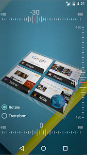
3D effect of object
11. Positioning an object from bottom of the screen
Basically, when you move an object, the position is saved with Y distance from the top of the screen. You can change this positioning system to work from the bottom of the screen for each object when "Fit content to the screen height" option is on in the page options. (Referred in the item 6 of Managing pages). Just toggle the "Y-position" button on the bottom menu bar. This would be helpful to keep the stable position of the object from the bottom when you migrate the layouts to another device with different screen aspect ratio. (In fact, this is very important feature for the theme developers because they must consider the many devices with different screen ratio.)
12. Guidelines
While moving or resizing the selected object, guidelines help you to align it to another object easily by snapping. You can turn off the guidelines by toggling off the guidelines button on the bottom menu bar.
One important tip:
"Long press for editing options."
With Total Launcher, customization knows no bounds.
* Device Admin privileges are necessary for implementing the "screen lock" launcher action.
* Accessibility service API is only used for specific launcher actions like:
- Opening recent apps
- Screen lock
No additional information is accessed through this permission.
- Version3.0.9
- UpdateOct 16, 2024
- DeveloperTotal_Apps
- CategoryPersonalization
- Requires AndroidAndroid 8.0+
- Downloads1M+
- Package Namecom.ss.launcher2
- Signature7a348bba26176eb1df533cfc19ac990f
- Available on
- ReportFlag as inappropriate
-
NameSizeDownload
-
5.85 MB
-
5.38 MB
-
5.48 MB


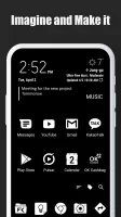
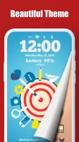
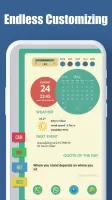
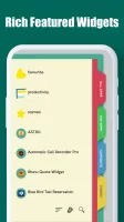
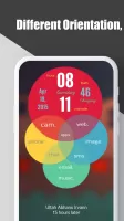
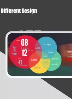
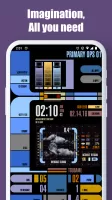






Provides a wealth of customization options
Users can create shortcuts, folders, and widgets to easily manage applications and information
Supports downloading themes from the community, so users can easily get unique layouts made by other designers, saving customization time
It may take time to familiarize yourself with various functions and settings when using it for the first time
The app does not support traditional dock design
Some themes are not compatible with devices